 |
|


 Sep 30, 2009, 05:41 AM // 05:41
|
#81 |
|
Krytan Explorer
Join Date: Jul 2006
Guild: Shiverpeaks Search And Rescue [Lost]
Profession: W/
|

Month and a half! It's not necromancy unless it's over a year old.
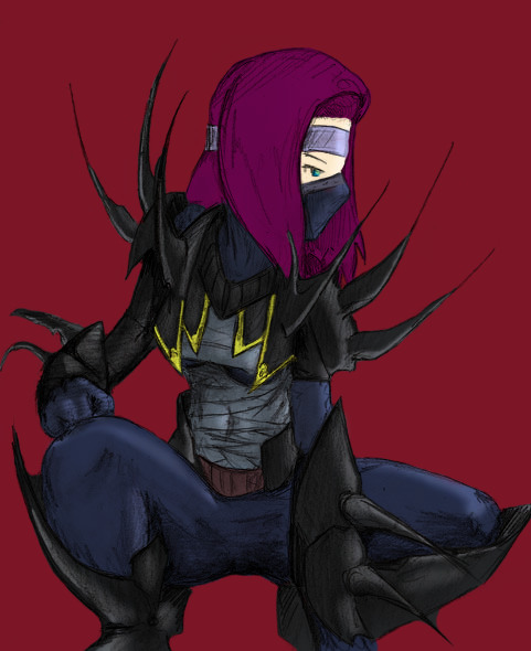 Stage of Development: Done with room for improvement Please look at: Lighting/Coloring Harshness: 10 Comments/Notes: Basic coloring/shading practice. The image used was taken from Egnki's old old old thread. Paint Okay?: Yes |

|

|
|
Sep 30, 2009, 06:25 AM // 06:25
|
#82 |
|
Wilds Pathfinder
Join Date: Mar 2006
Location: CA
Profession: N/
|
Looks good so far.
The shading looks kind of flat to me. I think you should try pumping volume with higher contrast, and try to shade with color instead of adding black and white. The solid red background can be a bit distracting when you are trying to figure out light. I recommend something like a light beige, off-white, or a light steel blue. Make sure you know exactly where the light source is coming from and what kind of light source it is. Warm lights (sun/incandescent bulbs) will make the figure and clothing look different than with cool lights (diffuse sky lighting, fluorescent lights etc). Try to think about local color vs lighted color as well, because I think a bit too much of the original color is showing through for a piece with such strong directional lighting. Also, try to shade the whole figure as a cohesive, instead of part by part. With the right leg, the torso will be blocking most of that light it's getting. Keep trying at it! |
|
|
|
|
Sep 30, 2009, 01:34 PM // 13:34
|
#83 |
|
Wilds Pathfinder
Join Date: Nov 2008
Location: California
Guild: Lucid Spirits [LIFE]
Profession: N/A
|
I agree with Blue. The chest, to me, looks fine, but the rest of the body could use some work. Also the hair - shading on hair works wonders; you get three-dimensionality and more realistic hair in one fell swoop. I usually go nuts shading hair even when I'm not planning on shading, so... ya.
But anyway try upping the contrast, esp. on the legs, and add some dimensionality to the hair. Other than that, it's coming along quite well. |
|
|
|
|
Sep 30, 2009, 02:09 PM // 14:09
|
#84 |
|
Krytan Explorer
Join Date: Mar 2008
Profession: N/
|
I'd agree that background is overpowering the image, being so strong and flat it has a tendency to draw the eye away from the actual figure itself.
|
|
|
|
|
Oct 02, 2009, 05:07 AM // 05:07
|
#85 |
|
Krytan Explorer
Join Date: Apr 2007
Location: State of Nolani
Guild: When the trolling stops, the drawing stops too
Profession: W/
|
i think depending on artist involved, where poses are concerned it swings between the realism of the pose and stylising it a little to get a stronger pose. while araiia's pose wasnt accurate in the sense of would an archer really look like that shooting from a squating position, it was believable. i suppose it is the individuals choice about whether to be really accurate or just going for looks.
if u look at photographs taken of rl wingchun kungfu poses, some of them look weak and undynamic, if used as a pose reference may result in a slightly weaker final outcome, so an artist might well take the reference and redo the pose to make it stronger and more dynamic. case of personal choice i think on the part of the artist. as for foreshortening, it can be a real bitch, u can paint something accurately but it can still look weird. so u either alter it so it doesnt look as weird or u can be really careful when choosing poses that include any sort of foreshortening. |
|
|
|
|
Oct 02, 2009, 12:08 PM // 12:08
|
#86 |
|
Academy Page
Join Date: Sep 2005
Location: Australia
Guild: Squee Squeeeeeeeeeeeeeeeeeeeeee [yay]
|
eeeek
Not sure whether to dump all my crap here for review or make my own thread to avoid hijacking but I'll make a start here at least :P
firstly: Title: Recent Sketch of My Lame Name Character (in her spiffy new armor  ) )Stage of Development: Unfinished (it is in my "final review of sketch before ink/colour if i choose to do so" stage) Please look at: proportions (I'm a stinker at it) specifically arms/face and suggestions as to how to convey more movement Harshness: 7, though I might not be able to implement all changes suggested. (No offense by it! Sometimes I have trouble re-doing to the same quality that I did before with the fiddly spots (hands, faces bleh)) Comments/Notes: I talk to much when I'm nervous Paint Okay?: Yush pleash Second wooo: IMG Title: Horrorween contest entry (potential? Is it cheating if I get some technical feedback on it? Dx) Stage of Development: Unfinished, near cleanup/inking stage Please look at: THE NECRO UGH, and foreshortening on the ele's left hand, and anything else people can think of :[ Harshness: 9, I wanna clean it up a bit before giving it to someone else. Comments/Notes: Not even sure if I'm going to enter it into the comp, but it is done (I liked the Frozenwind character and really really just wanted to draw him!) and I'd like to give it to him anyway in a reasonable state Paint Okay?: Yerr Hope people will have time to have a quick look. Thanks in advance if you do! PS hope they are not too big I will resize them if they are :s |
|
|
|
|
Oct 02, 2009, 04:24 PM // 16:24
|
#87 |
|
Desert Nomad
Join Date: Mar 2007
Location: UK/Austria
Guild: [bone]
Profession: P/
|
@ Bai
I really like those, both of them. Very promising, in any case. There are two things that strike me about the first one - first, I think (in terms of proportions) the torso is too short for the arms/head. If you rotated the arm, the elbow would come down all the way to the pelvis, which is a bit too far  however, I like the fiddly bits (aka hands/face). the second thing is somehow related to dynamics. From the way she's holding the hammer, it looks as if she's about to bring it straight down, sort of left-knee-area-ish. However, she's not looking there (and, doing fencing myself, it's a good idea to look at what you're trying to kill). You were probably going for a swing-from-back-over-left-shoulder-to-front thingy, but for that, the perspective on the hammer is a bit off. If you know what I mean... uhm.. [lol @ myself trying to explain these things xD] yeah however, I like the fiddly bits (aka hands/face). the second thing is somehow related to dynamics. From the way she's holding the hammer, it looks as if she's about to bring it straight down, sort of left-knee-area-ish. However, she's not looking there (and, doing fencing myself, it's a good idea to look at what you're trying to kill). You were probably going for a swing-from-back-over-left-shoulder-to-front thingy, but for that, the perspective on the hammer is a bit off. If you know what I mean... uhm.. [lol @ myself trying to explain these things xD] yeahThe second one looks fine to me, except that both characters' left hands/arms are smaller than their right ones. Other than that, I'd definitely enter this picture, it's looking great! Hope that helps 
|
|
|
|
|
Oct 05, 2009, 01:37 PM // 13:37
|
#88 |
|
Frost Gate Guardian
Join Date: Feb 2008
Location: The other side of the rainbow
Guild: Medieval Knights of Darkness [MKOD]
Profession: N/
|
http://i245.photobucket.com/albums/g...poleon/Oil.jpg
Stage of Development: 15 minute mark Please look at: The sky, shadows, blending of background colors Harshness: 8 Since I do not own a tablet, it is much harder in general to get things done. Any comments would be appreciated Comments/Notes: Well I took a screeny that I was going to use in the ecto-ba-looza contest, but I decided it was too boring to bother using. It still looked nice (to me) so I decided to print it out and try to recreate it with oils in photoshop. Paint Okay?: Yes, but I don't know why anyone would want to. |
|
|
|
|
Oct 10, 2009, 06:26 AM // 06:26
|
#89 |
|
Ascalonian Squire
Join Date: Jul 2009
Guild: the counter culture
Profession: N/
|
just looking for some advice for my drawing (backround isnt done just started it) feel free to paint over it just looking for advice on the character and if everything looks right and in proportion
|
|
|
|
|
Oct 19, 2009, 12:30 PM // 12:30
|
#90 |
|
Furnace Stoker
Join Date: Dec 2006
Guild: [Bone]
Profession: Mo/
|
I'm looking for some advice on how to continue on this vector thing. I'll just tell you guys what my experience is at making "art": zero. I'm making this for my sister as she has a tiny white side table, which she wants me to make something for, and that would be a cow
 Now I had the idea (as the table is white) to only paint the black parts, which brought me to the idea of making a vector kind of thing, as far as you can call it vector Now I had the idea (as the table is white) to only paint the black parts, which brought me to the idea of making a vector kind of thing, as far as you can call it vector So this is what I have at the moment: Looking on what to do to continue, freshening it up a bit. I'm not thinking about adding up the body. I was hoping you could give me some advice on putting in some eyes. I prefer to only use 1 extra colour, which at first was supposed to be green from a few picks of grass out of his mouth. So please give me feedback on eyes/something that comes to your mind You can be as ego-killing as you like, just remind my level of photoshopping, so dont use too many technical terms, again I'm not advanced. Cheers! |
|
|
|
 |
|

«
Previous Thread
|
Next Thread
»
| Thread Tools | |
| Display Modes | |


 Linear Mode

|
|

All times are GMT. The time now is 07:21 AM // 07:21.
